Fussy Formatting?
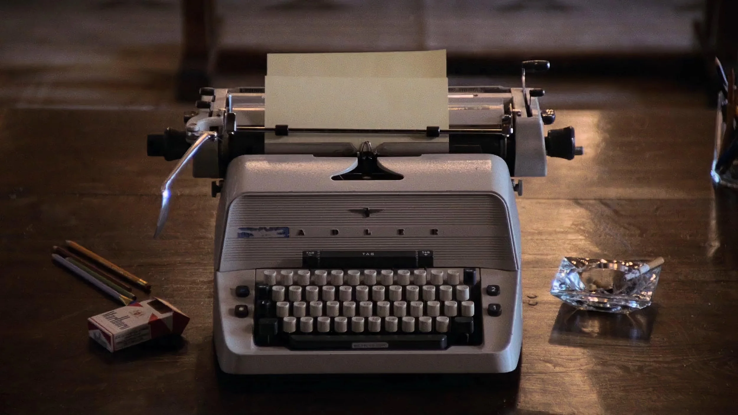
Publishers package a manuscript into a product – something to attract readers’ attention. The cover, the testimonials, and the blurb on the back epitomise the process. Apart from the power of storytelling itself, once the book has been purchased, it’s the feel of the physical book – the feel of the paper, the quality of the printing, the typesetting and formatting of the text that affects the reading experience.
Prior to ebooks, the print quality of physical books seemed to be in decline. Quality, it appeared, had been increasingly sacrificed for cost savings. The typesetting often squeezed the text (using smaller fonts, smaller line heights, narrow margins, and less space at the start of new chapters) to reduce the overall cost. The tactile quality of physical books had declined, along with the reading experience.
The arrival of ebooks gave readers new options. The ability to change the text size and choose a font. Physical books lost market share. Since then, publishers have reconsidered the physical book as an object. The paper quality has improved. The printing has sharpened. Novels, I would argue, are formatted with more consideration for a great reading experience (the kind previously associated with premium hardbacks).
The typesetting – the formatting of the text – is another critical part of the reading experience. This means a standardised and consistent approach that lets the reader get through the story with the least amount of confusion or distraction.
In the UK we generally use single quotes for dialogue:
‘The fox jumps over the lazy dog,’ he said.
It does a good job of indicating clearly where the dialogue is without being too intrusive. The US uses double quotation marks, which do look slightly more cluttered:
“The fox jumps over the lazy dog,” he said.
French has the guillemet (« ») for standard use and the em-dash for novels:
— The fox jumps over the lazy dog, he said.
There are many different variations of dialogue quotes. German has low-high double quotes („ “) or the inward pointing guillemet (» «). Japanese and Mandarin have corner brackets (「 」 and 『 』). The problem comes when there’s nothing to identify the dialogue:
The fox jumps over the lazy dog, he said.
This originates from Modernist writers like James Joyce, which in turn influenced writers like Cormac McCarthy. The trend continues with contemporary writers like Sally Rooney and Tim Winton. Cormac McCarthy also removed chapter titles and chapter numbering. Indicating dialogue helps the reader. Distinctive chapters provide useful way finders through a novel, which makes the text more accessible.
The rise of the internet and ‘business formatting’ has seen an increase in spaces between paragraphs. In a novel, a space between paragraphs has a functional purpose. It indicates a change of scene (a change in time or location). Having a gap between every paragraph looks weird in a novel, but it’s normal in digital content. This originates from a time when formatting text was difficult for screen content. Also, screens offered a much lower viewing quality than print. Peter Heller’s novel The Dog Stars is a great read, but why does it have a gap between every paragraph, like it’s been formatted in Microsoft Word?
The formatting and layout of the text in a novel is not a fussy detail – it makes the text more accessible.